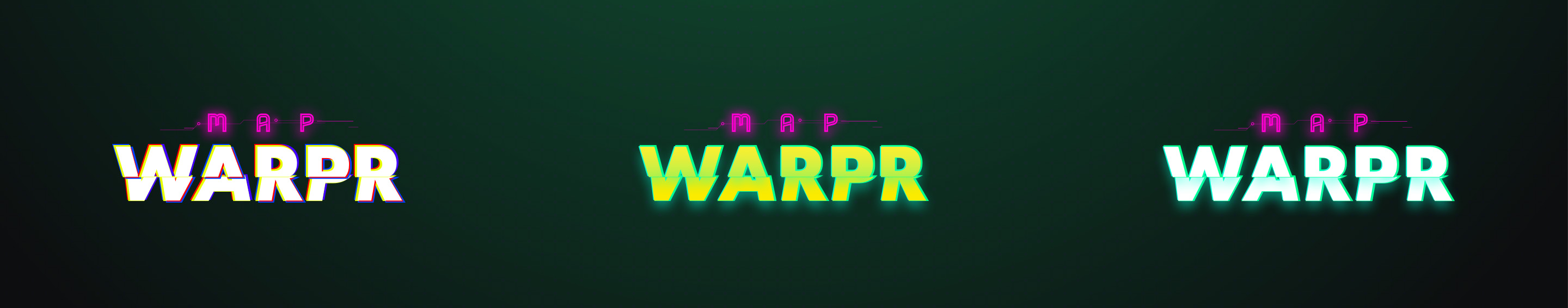
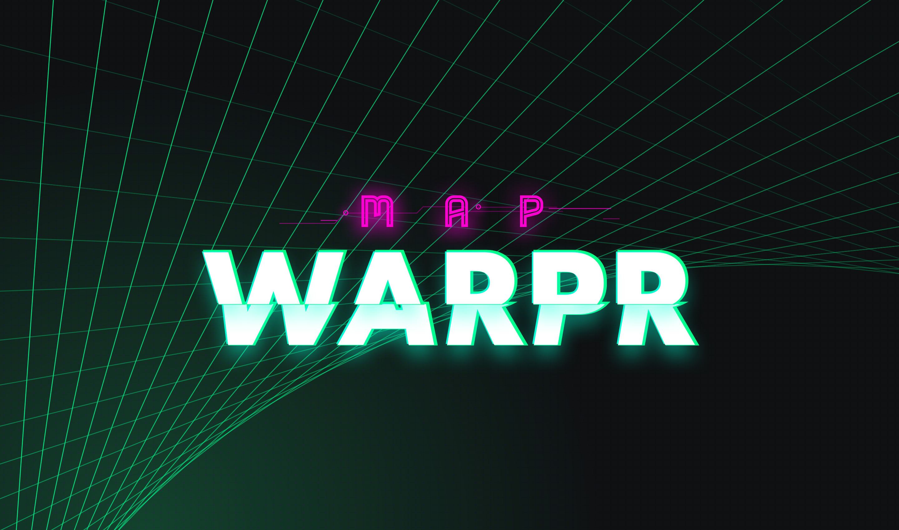
Branding
What’s the significance of the 80’s sci-fi theme? To be honest, there isn’t one. A coworker suggested the idea, and I’ve always wanted to design a brand and interface in the style, and so I ran with it.
User Interface
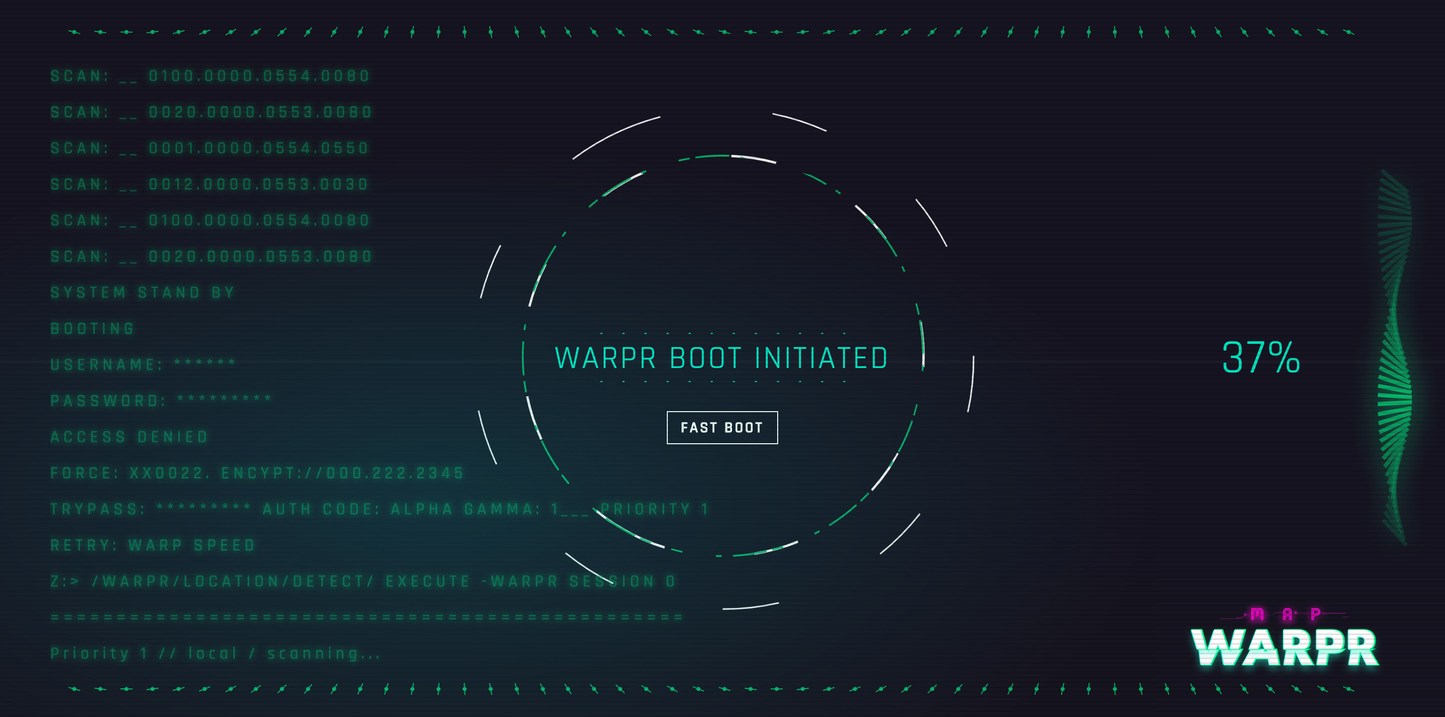
Inspired by Blade Runner, Altered Carbon and the numerous retro futurism movies out there, I started dreaming up the interface. Beyond movie inspiration, I drew from my memory of an old Intel pc my mom had in the early 90s. I remember the primary colors were neon green on flat black and the CRT screen was janky and glitched between screen transitions. With an idea of the look and feel, I approached the interface knowing I wanted the user to feel that they were a booting up and hacking into the “main-frame” of a terminal.
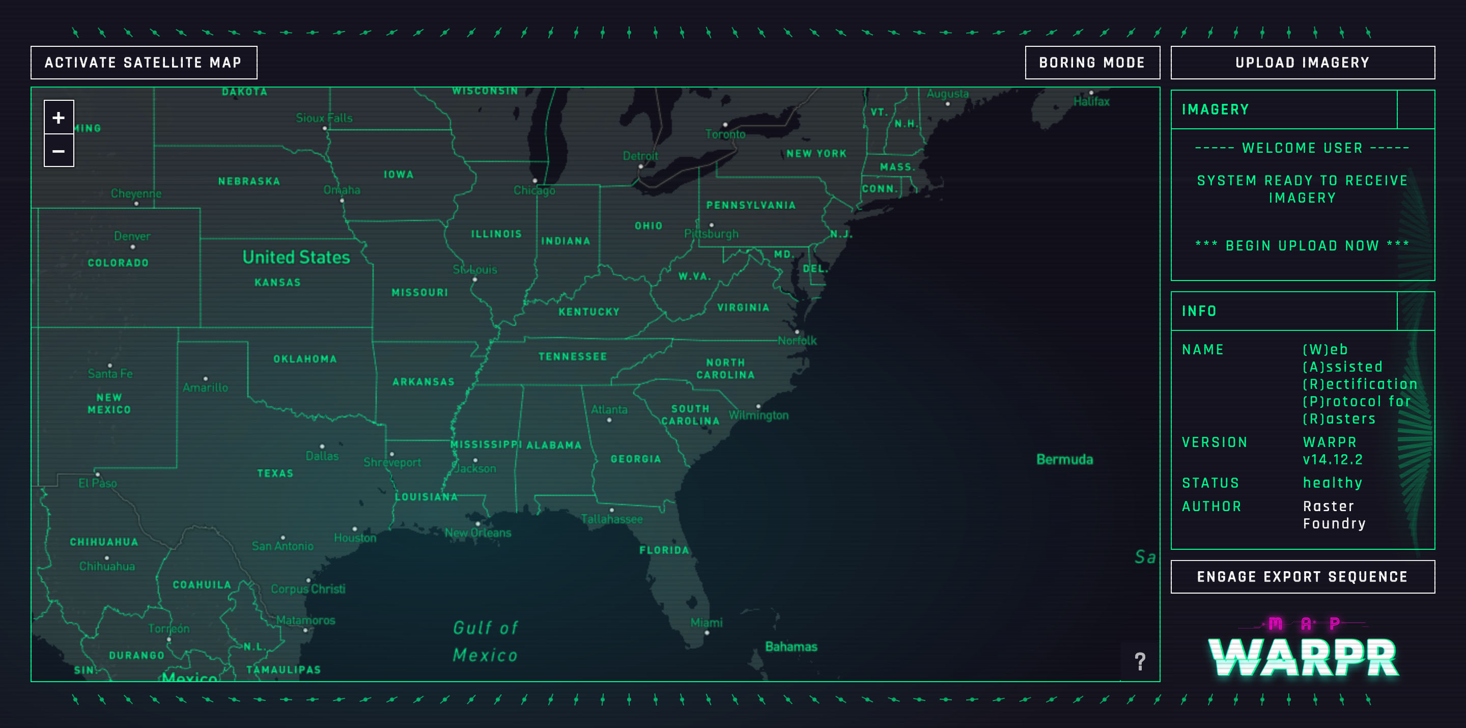
Boring mode
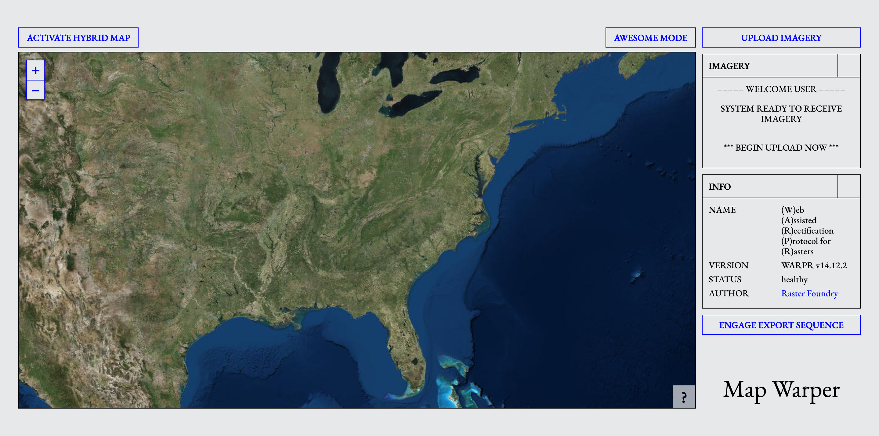
As it turns out, the retro UI isn’t very practical. Deep blacks and bright greens tend to overpower the imagery you’re warping, and there are issues with the animations eating up a lot of hardware resources. I wanted to keep everything I built, even if it wasn’t very practical, but I needed a compromise… enter boring mode. No animations, accessible colors, simpler basemaps… nice and boring.
Reflections
At the end of the day, I had a blast working on Map Warpr. We could have easily shipped it in and done something bland and basic from the start, but I’m glad we took the time to try something new and bold.
Ultimately, there are a handful of UX issues with the final project, but grant and contract requirements were fulfilled and was an overall success. Due to budget and time constraints, we piggy-backed on an open source tool (thanks!!) which came with a handful of bugs, but was essential to completion. If we were to continue working on the project I’d like to focus on the following:
- allow multi-image warping
- fix the various bugs in the distortable image library
- make the warping interaction more fluid
- allow warping from any portion of the image, not just corners
- better optimize the animations
- provide a basic explanation of what the tool is